Matilda Wilson Creative were approached by Sanitarium with the opportunity to redesign their So Good international packaging while maintaining their domestic orientation and paying respect to the heritage brand developed over the past 30 years.
Service
Art Direction, Brand Strategy, Packaging Design, Digital Design
Client
So Good, Sanitarium
Year
2023

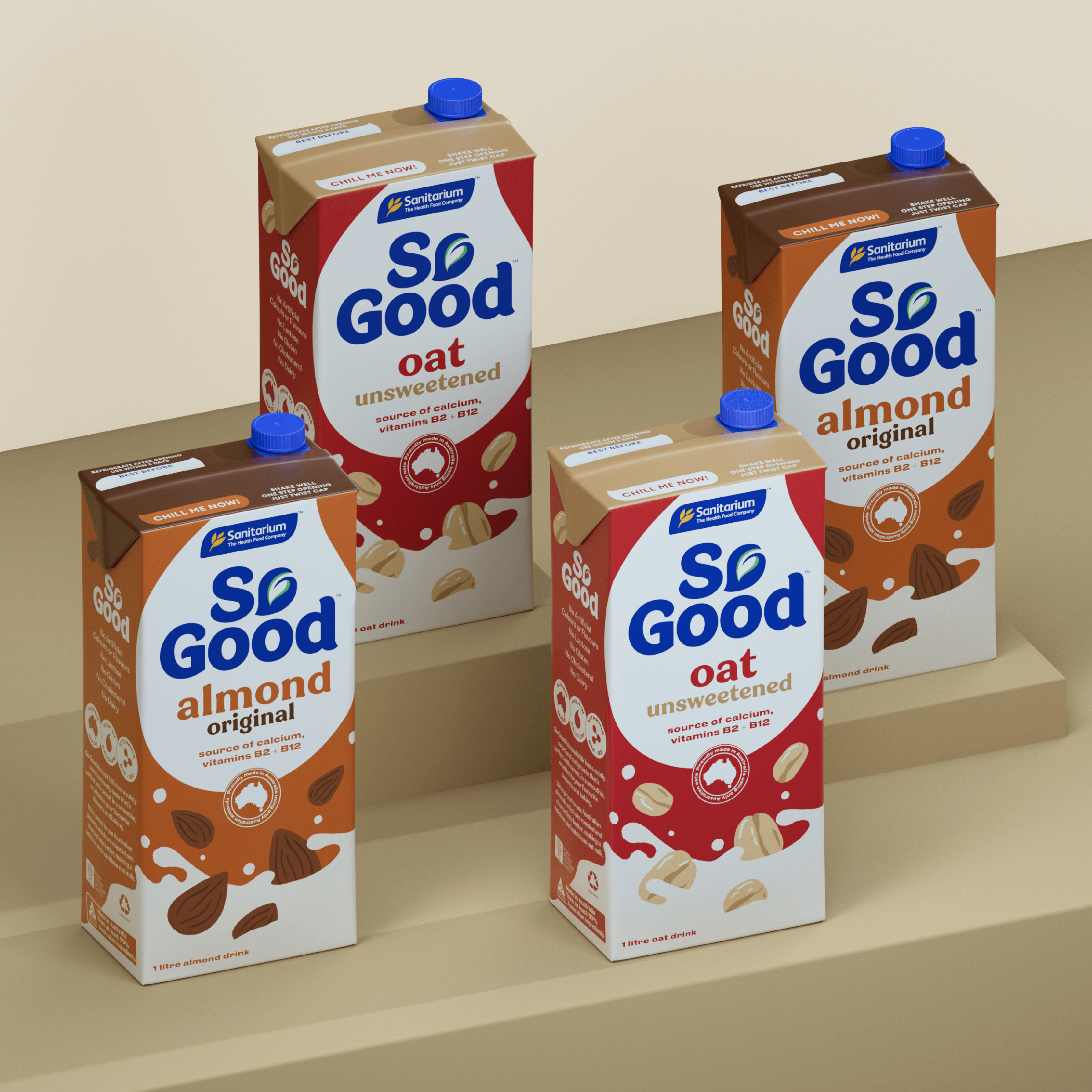
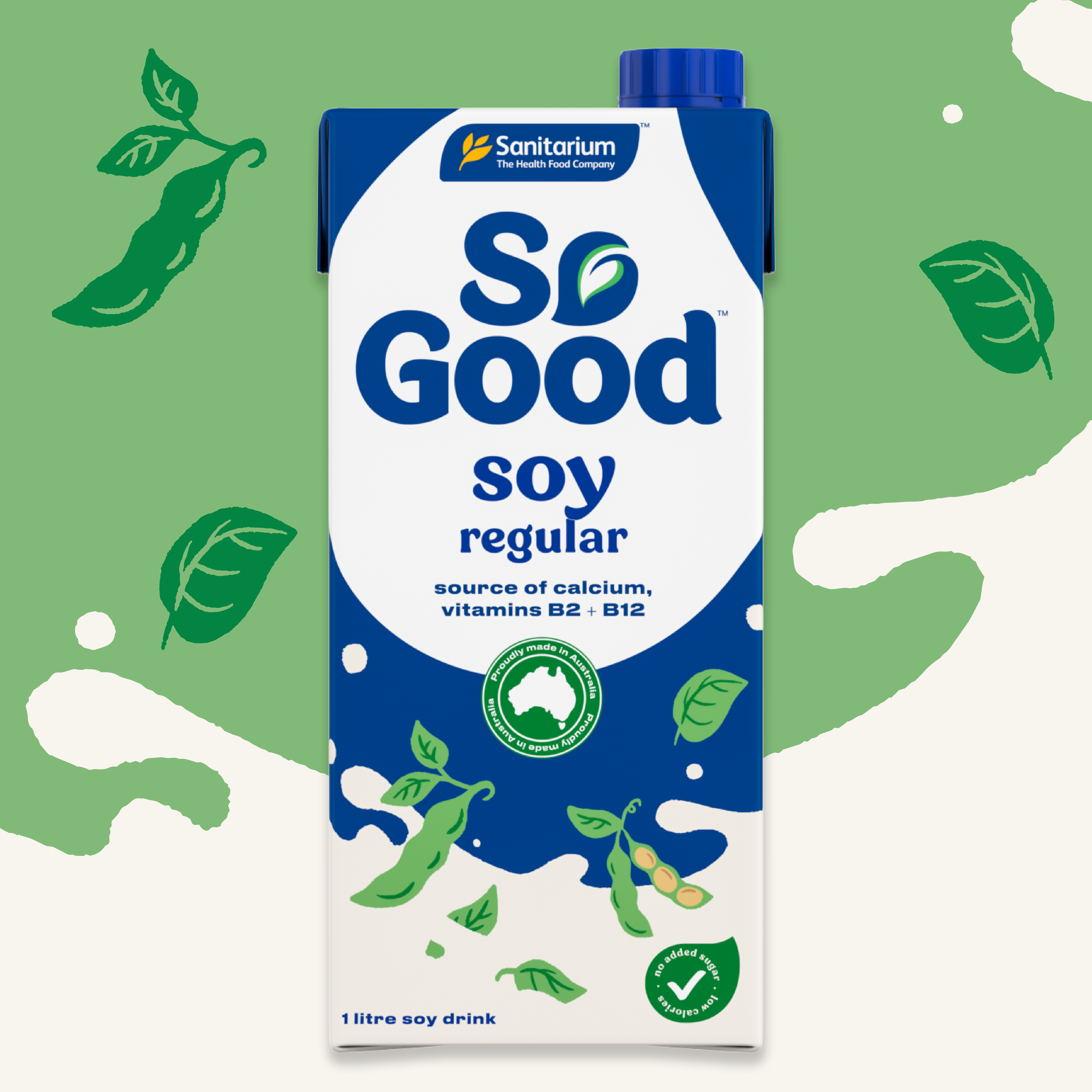
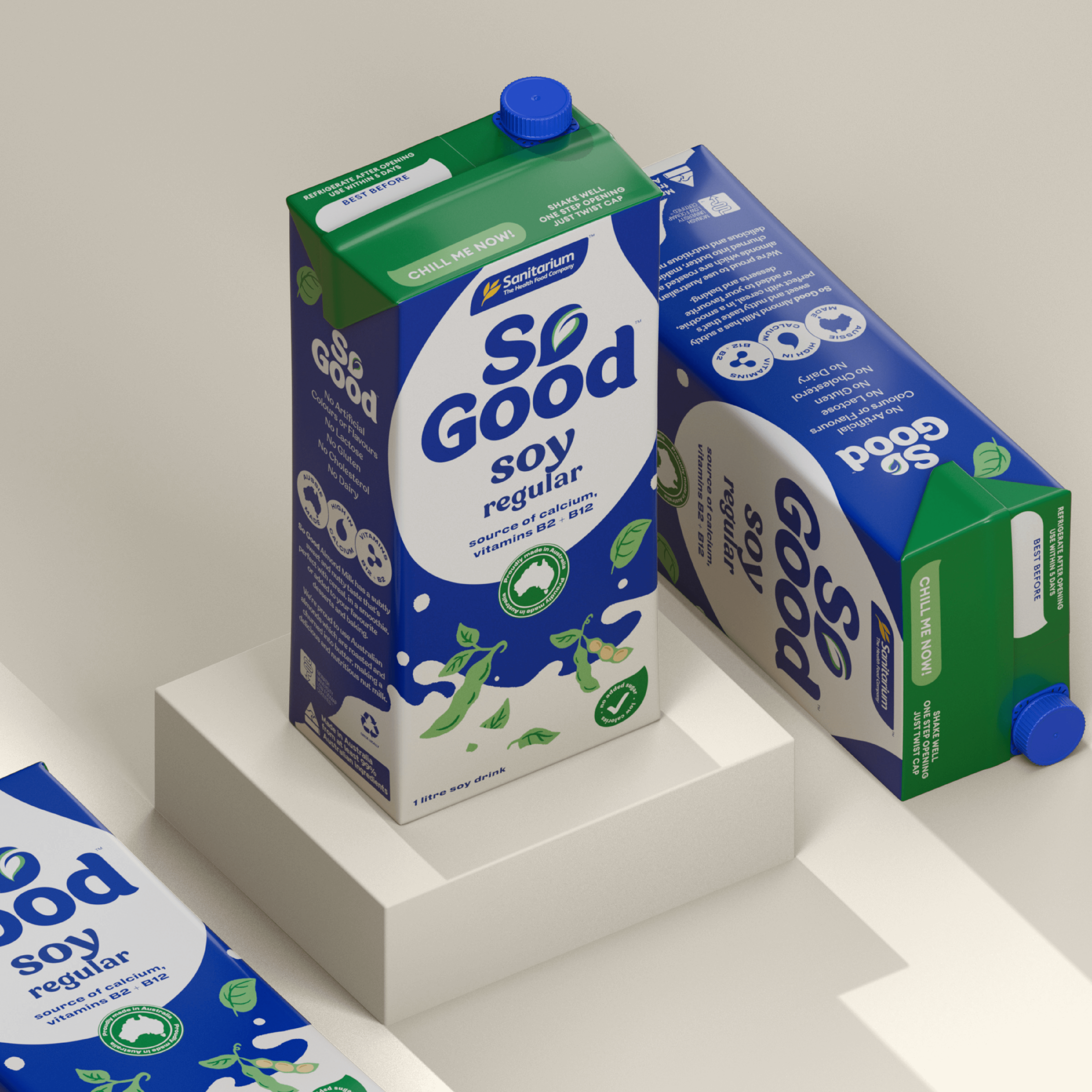
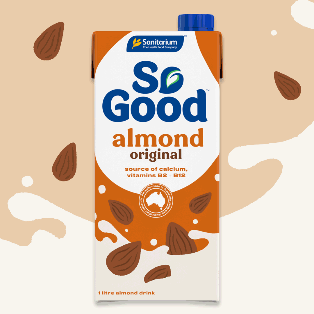
The core range of So Good International consists of 4 variations, alongside an additional 5 which are domestic packs and carried over, this posed creative limitations but allowed Matilda the opportunity to effectively problem solve their current packaging dilemmas while projecting a long term plan for their full range, drip feeding a redirection and maintaining current consumer trust. MWC worked from a considered standpoint, maintaining respect to the domestic markets, the relativism of the current packaging across consumer bases and added our own creative flare with potential to grow.
The current packaging felt dated, disconnected and didn’t properly represent the attributes of the So Good brand that consumers had come to love, our Aussie Farmer emphasis and healthy standpoint. Although largely represented on shelf, So Good lacked the personality and connection that a vast majority of beverage competitors were nailing.
Heritage, Language and Modern Markets
Matilda Wilson engaged Molly Wellington, an Australian based illustrator to develop a core range of branded illustrations that depicted the digitally designed scenes currently seen on domestic packs and repositioned such as fun, playful and fresh without completely departing from what they represented.
Further to that, Matilda broadened the brands colour schematic, hero’ed the Australian standpoint centring such across all packs and deep dived into a no-fuss, approachable typographic suite that was easily translated across the 42 countries in which it was presented.